Probability Example
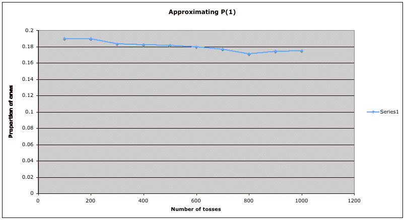
This graph illustrates the empirical definition of probability. The
horizontal axis shows the number of tosses of a fair die. The vertical
axis shows the proportion of those tosses which came up 1.
(These
are also shown in the table below.) The trend of the graph is that as
the number of tosses increases, the proportion of ones approaches the
true probability of 1/6 = 0.16666... . Notice that the zeroing in on
the true value is not steady -- in this particular simulation, there is
some moving upward from 800 to 1000. However, if we increased the
number of tosses to 2000, 3000, etc., we would expect the calculated
proportions to vary less and less from the true value.
| Number of Tosses |
Proportion of Ones |
| 100 |
0.19 |
| 200 |
0.19 |
| 300 |
0.18333... |
| 400 |
0.1825 |
| 500 |
0.182 |
| 600 |
0.18 |
| 700 |
0.177142857 |
| 800 |
0.17125 |
| 900 |
0.1744... |
| 1000 |
0.175 |